Table of Contents
- 1. Mastering Negative Space: The Foundation of Minimalist Monochrome
- 2. Leading Lines: Directing the Eye Through Minimalist Frames
- 3. Abstract Compositions: Finding Geometry in Everyday Scenes
- 4. Camera Settings and Equipment for Minimalist Black and White
- 5. Post-Processing Techniques for Clean, Graphic Monochrome
1. Mastering Negative Space: The Foundation of Minimalist Monochrome
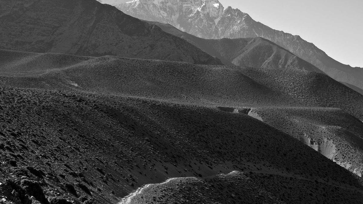
Negative space is the breathing room in your frame -- the empty areas that surround your subject. In minimalist black and white photography, negative space isn't wasted; it's a deliberate compositional tool that amplifies impact. When you strip away color, the relationship between subject and emptiness becomes the entire story. A single tree against a vast white sky, a lone boat on a glassy lake, or a solitary figure in a wide plaza all rely on negative space to create tension and tranquility simultaneously.
The key to effective negative space is intentionality. Ask yourself: what does the emptiness add? In black and white, negative space often carries subtle tonal gradients that add depth without clutter. For example, a foggy morning landscape might offer a smooth gradient from light gray to white, providing a soft backdrop that makes a dark silhouette pop. Use a wide aperture (f/2.8 to f/4) to keep the subject sharp while letting the background fall into soft, uniform tones. Alternatively, a narrow aperture (f/11 to f/16) keeps everything in focus, emphasizing the stark contrast between subject and space.
When composing, place your subject off-center using the rule of thirds or even more extreme placements. A subject pushed to the bottom third of the frame with two-thirds empty sky above creates a feeling of isolation or grandeur. Experiment with extreme negative space -- leave 80-90% of the frame empty. This forces viewers to contemplate the relationship between the small subject and the vast environment. In post-processing, use the tone curve to compress highlights and lift shadows, creating a clean, almost graphic look that enhances the emptiness.
Expert Tip: In minimalist black and white, negative space should occupy at least 60% of the frame for maximum impact. Use a polarizing filter to deepen skies and reduce reflections, creating cleaner, more uniform empty areas.
2. Leading Lines: Directing the Eye Through Minimalist Frames
Leading lines are the visual highways that guide the viewer's eye through your photograph. In minimalist black and white work, lines become even more critical because they provide structure in an otherwise sparse composition. A single curved road, a row of pillars, or the edge of a building can transform a simple scene into a powerful abstract statement. The absence of color forces the viewer to follow these lines with heightened attention, making every curve and angle deliberate.
The most effective leading lines in monochrome are those that contrast sharply with their surroundings. A white railing against a dark wall, a black shadow cutting across a light floor, or a series of evenly spaced lampposts receding into fog all create strong directional cues. Use a wide-angle lens (16-24mm on full-frame) to exaggerate perspective and make lines converge dramatically. Position yourself so the lines start from the bottom corners or edges of the frame, drawing the eye inward toward the subject or vanishing point.
For abstract compositions, look for lines that intersect, overlap, or create geometric patterns. Staircases, bridges, and modern architecture are rich sources of intersecting lines. In post-processing, increase clarity and sharpening to make lines crisp and defined. Use the adjustment brush to selectively darken or lighten specific lines, enhancing their prominence. Remember that lines don't have to be straight -- curved lines like winding paths or spiral staircases add a dynamic, organic feel that contrasts beautifully with the starkness of black and white.
3. Abstract Compositions: Finding Geometry in Everyday Scenes
Abstract black and white photography strips subjects down to their essential shapes, textures, and patterns. The goal is to create images that are visually intriguing without relying on recognizable subjects. A close-up of peeling paint, the repeating arches of a colonnade, or the interplay of light and shadow on a textured wall can become compelling abstract compositions. The absence of color forces the viewer to appreciate form, contrast, and texture on a purely visual level.
Start by training your eye to see patterns in everyday environments. Look for repetition -- rows of windows, tiles, or fence posts. Then break the pattern by introducing a disruption: a single missing tile, a shadow falling across the repetition, or a change in texture. This creates visual tension and interest. Use a telephoto lens (70-200mm) to isolate small sections of larger scenes, compressing perspective and flattening depth to emphasize two-dimensional patterns. A macro lens (60-100mm) works well for extreme close-ups of textures like rust, wood grain, or fabric.
Lighting is everything in abstract black and white. Side lighting at a low angle (early morning or late afternoon) creates long shadows that emphasize texture and form. Overcast days provide soft, even light that reveals subtle tonal variations without harsh highlights. In the studio, use a single hard light source (like a bare bulb or small softbox) to create dramatic shadows that define shapes. Post-process with high contrast and increased texture slider to make every detail pop. Convert to black and white using the channel mixer, paying special attention to the red and blue channels to control how different tones translate to grayscale.
4. Camera Settings and Equipment for Minimalist Black and White
While any camera can produce minimalist black and white images, certain settings and gear make the process easier and more effective. Shoot in RAW format to retain maximum tonal information -- black and white conversion is a destructive process, and RAW files give you the latitude to adjust exposure, contrast, and channel mixing without degrading image quality. Set your camera to monochrome preview mode if available; this helps you visualize the final result while shooting, but always capture in color RAW for post-processing flexibility.
For lens choice, prime lenses with fixed focal lengths often produce sharper images with better contrast, which is crucial for black and white work. A 35mm or 50mm lens is versatile for street and architectural minimalism, while a 24mm wide-angle exaggerates perspective for dramatic leading lines. Use a tripod for long exposures, especially when shooting in low light or using small apertures for maximum depth of field. A cable release or remote shutter prevents camera shake during long exposures.
Exposure settings depend on your subject and desired effect. For high-key minimalist images (mostly white with small dark accents), overexpose by +1 to +2 stops to blow out backgrounds while retaining detail in the subject. For low-key images (mostly black with small light accents), underexpose by -1 to -2 stops. Use spot metering on your subject to ensure proper exposure. In post-processing, use the histogram to check for clipped highlights or shadows -- a small amount of clipping in the background is acceptable for minimalist work, but avoid losing detail in your main subject.
5. Post-Processing Techniques for Clean, Graphic Monochrome
Post-processing is where minimalist black and white images truly come to life. Start with a solid black and white conversion using the channel mixer. For a classic look, set red to 60%, green to 40%, and blue to 0% -- this mimics traditional black and white film. For more dramatic contrast, increase the red channel to darken blue skies and lighten skin tones. Use the luminance sliders to brighten or darken specific colors independently, giving you precise control over how different elements translate to grayscale.
Next, adjust the tone curve to create a clean, graphic look. An S-curve increases contrast by darkening shadows and brightening highlights, but for minimalist work, you may want a more extreme curve -- pull the shadows down and highlights up to create a high-contrast, almost posterized effect. Use the clarity slider (20-40) to enhance midtone contrast and make textures pop. Be careful not to overdo it; too much clarity creates halos and looks artificial. The texture slider (10-20) adds fine detail without affecting edges, perfect for abstract close-ups.
Finally, use local adjustments to refine specific areas. The graduated filter can darken skies or lighten foregrounds. The radial filter draws attention to your subject by brightening it and darkening the surrounding area. Use the spot removal tool to eliminate dust spots or distracting elements -- in minimalist work, even a small speck can ruin the clean aesthetic. Save your settings as a preset for consistent editing across a series. Export at 300 DPI for print or 72 DPI for web, with sRGB color space for online display.
Beyond the foundational techniques, developing a personal workflow around minimalist black and white space lines abstract can significantly improve your consistency and results. Many photographers find that creating a routine helps them avoid common oversights and ensures they capture the best possible image in any situation. Over time, this workflow becomes second nature, allowing you to focus more on creative decisions and less on technical adjustments.
Another valuable approach is to study how experienced photographers handle minimalist black and white space lines abstract in their professional work. Analyzing real-world examples provides insight into techniques you may not have considered and reveals creative solutions to common challenges. Try recreating specific shots you admire, then adapt the underlying principles to your own style and subject matter.