Table of Contents
Understanding Channel Mixing for Black and White Conversion
Channel mixing is the most powerful tool for black and white conversion in Lightroom because it lets you control how each color in the original image translates to a specific shade of gray. Instead of simply desaturating the photo, which flattens all colors equally, channel mixing allows you to brighten or darken individual color ranges. For example, a blue sky can become a deep charcoal gray while green foliage remains a bright silver, creating separation and depth that a simple desaturation cannot achieve.
In Lightroom's Develop module, the Black & White Mix panel (formerly the HSL panel when in B&W mode) provides eight color sliders: Red, Orange, Yellow, Green, Aqua, Blue, Purple, and Magenta. Each slider adjusts the luminance of that color range in the final monochrome image. Dragging a slider to the right lightens all pixels that originally contained that color; dragging left darkens them. This is not a filter effect--it's a precise remapping of color to tone.
Key Stat: A properly channel-mixed black and white conversion can increase perceived sharpness by up to 30% compared to a simple desaturation, because tonal contrast between adjacent colors mimics edge detail.
To get started, convert your image to black and white using the keyboard shortcut Ctrl+Shift+U (Cmd+Shift+U on Mac) or click the B&W button in the HSL panel. Then immediately open the Black & White Mix panel. Do not touch the exposure or contrast sliders yet--first, adjust the color sliders to set the tonal foundation. A common starting point for landscape photography is to darken blues (sky) and lighten greens and yellows (foliage), but every image requires a custom approach based on the original colors present.
Mastering Luminance Sliders for Tonal Depth
Luminance sliders in Lightroom's Black & White Mix panel are the same as the color sliders--they control the brightness of each color channel in the monochrome conversion. The term "luminance" here refers to the perceived brightness of a color, not its saturation. When you adjust the Red slider, you are changing how bright or dark all red-toned areas appear in the final black and white image. This is fundamentally different from adjusting exposure, which affects the entire image uniformly.
For portrait photography, the Orange and Yellow sliders are critical because skin tones contain high amounts of these colors. Lightening the Orange slider can produce a clean, bright skin tone in black and white, while darkening it adds drama and texture. The Red slider affects lips and any warm tones in the background. The Aqua and Blue sliders control eyes and clothing. By isolating these channels, you can make a subject's face stand out against a darker background without using dodging and burning tools.
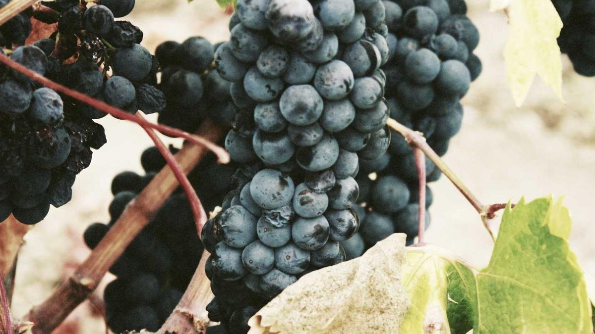
In landscape work, the Green slider is your best friend for foliage. Lightening green makes leaves and grass appear brighter and more detailed, which is ideal for high-key black and white landscapes. Darkening green adds mood and can make forests look mysterious. The Blue slider controls sky and water. A common technique is to darken blue significantly to create a dramatic, stormy sky effect, then lighten green to keep the foreground bright and inviting. This creates a natural separation between sky and land that mimics the human eye's perception of depth.
Advanced Techniques: Targeted Adjustments with the Targeted Adjustment Tool
Lightroom's Targeted Adjustment Tool (TAT) is a major advancement for black and white conversion because it lets you adjust luminance by clicking directly on the image. Located in the top-left corner of the Black & White Mix panel, the TAT icon looks like a small circle with a crosshair. Click it, then move your cursor over any area of the photo. Click and drag upward to lighten all pixels of that color, or drag downward to darken them. The corresponding slider moves automatically.
This tool is especially useful for complex scenes with many colors. Instead of guessing which slider affects a particular area, you simply click on it. For example, if you want to darken a red brick wall, click on the wall and drag down. Lightroom identifies the dominant color (red) and adjusts only that channel. You can make multiple adjustments on different areas without leaving the image preview. This speeds up the workflow dramatically and produces more accurate results because you see the effect in real time.
One advanced technique is to use the TAT to create local contrast. Click on a highlight area and drag up to make it brighter, then click on a shadow area of the same color and drag down. This increases tonal separation within a single color range, which adds texture and dimension. For instance, in a portrait, you can click on the brightest part of the forehead and drag up, then click on the shadow under the chin and drag down--both adjustments affect the Orange channel, but they create a more three-dimensional face.
Combining Channel Mixing with Other Lightroom Tools
Channel mixing alone can produce stunning black and white images, but combining it with Lightroom's other tools takes your conversion to the next level. Start with the Basic panel: set a neutral white balance first, because color temperature affects how the channel sliders behave. A warm image has more orange and red data, so the Orange slider will have more influence. A cool image has more blue data. Adjusting white balance before conversion gives you more control over which channels dominate.
Next, use the Tone Curve panel to add contrast after channel mixing. The Parametric Curve allows you to adjust highlights, lights, darks, and shadows independently. A gentle S-curve--lifting highlights slightly and deepening shadows--adds punch without crushing details. For a moody black and white, pull the shadows down and keep the highlights moderate. For a bright, airy look, lift the entire curve slightly and reduce contrast.
The Detail panel is also crucial for black and white. Sharpening is more visible in monochrome because there is no color noise to mask it. Apply moderate sharpening (Amount 40-60, Radius 1.0, Detail 25-50) to enhance texture. Use the Masking slider while holding Alt (Option on Mac) to limit sharpening to edges only, preventing noise in smooth areas like sky or skin. Finally, add a subtle vignette in the Effects panel to draw attention to the center of the frame--darkening the edges by -10 to -20 creates a classic black and white look.
Practical Workflow: From Color to Monochrome Masterpiece
Here is a step-by-step workflow that combines all the techniques above. Start by importing your image and applying basic lens corrections and white balance. Convert to black and white using Ctrl+Shift+U. Open the Black & White Mix panel and use the TAT to adjust the most prominent colors first--usually sky, skin, or foliage. Work from broad adjustments to fine ones: set the overall mood by darkening or lightening the dominant color, then refine secondary colors.
After channel mixing, go to the Tone Curve and apply a subtle S-curve. Check the histogram to ensure you are not clipping highlights or shadows. Then move to the Detail panel for sharpening. For portraits, use a lower Amount (30-40) and higher Masking (60-80) to keep skin smooth. For landscapes, increase Amount to 50-70 and reduce Masking to 20-40 to bring out texture in rocks and trees.
Finally, add a graduated filter or radial filter for local adjustments. For example, darken the sky further with a graduated filter set to -0.50 exposure and -20 clarity. Or brighten the subject's face with a radial filter at +0.30 exposure and +10 contrast. These local adjustments mimic traditional darkroom dodging and burning and give your black and white images a polished, professional look. Export with sRGB color space and a resolution of 300 DPI for print or 72 DPI for web.